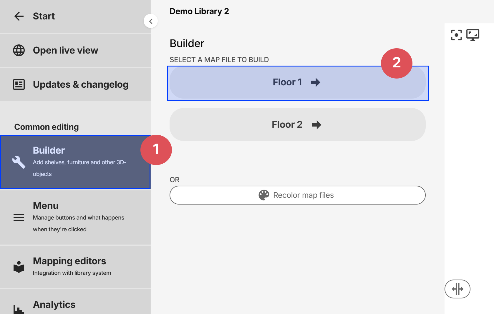
Builder
The Builder is where furniture, 3D-icons, text and other objects can be added, removed, edited and more.
The Builder can be accessed from the side menu:
Adding objects
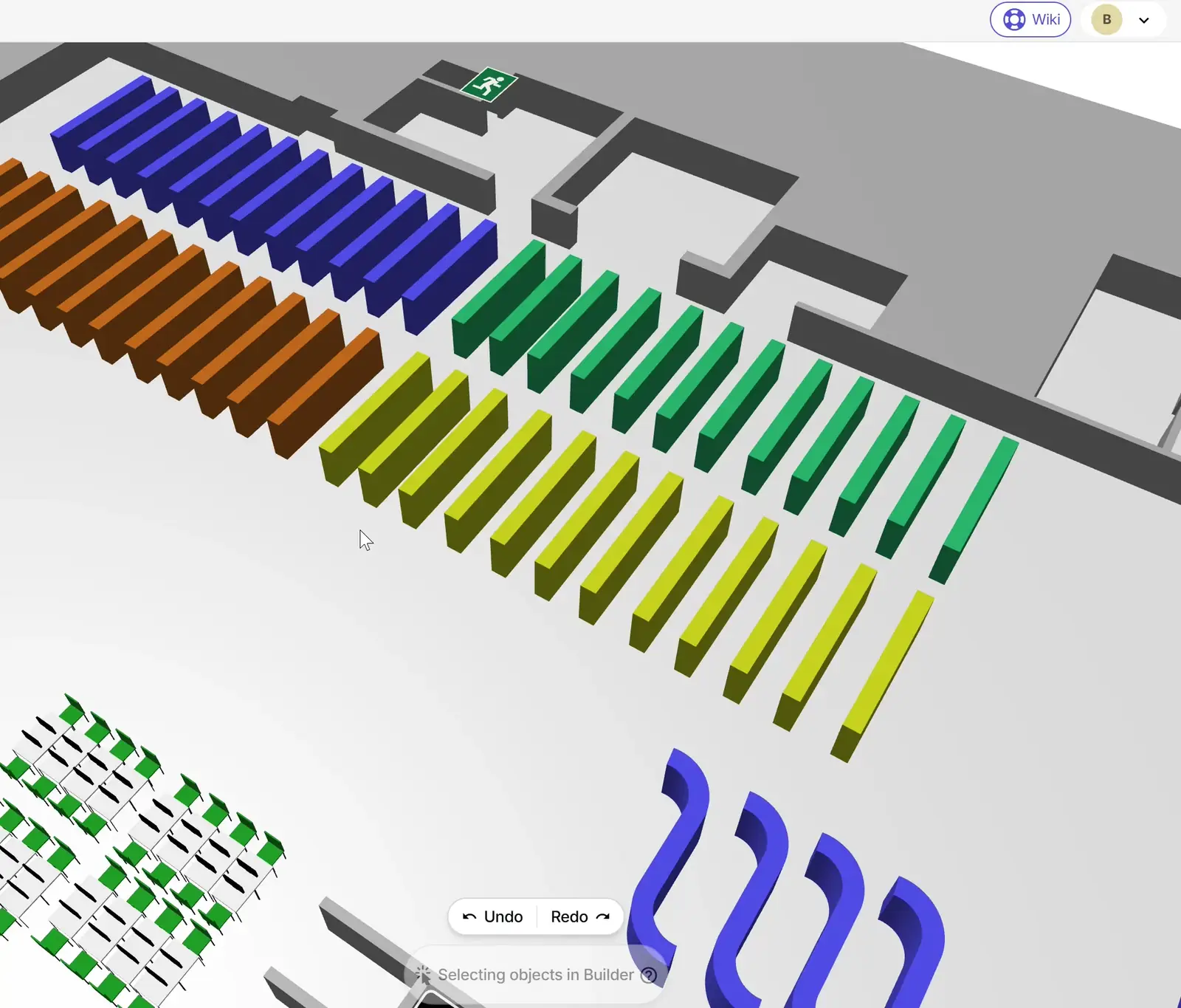
We've setup a library of 3D-components that can be added to the guide. It contains furniture such as sofas, tables and chairs, as well as shelves and 3D icons of elevators, toilets and more. Click on one of them to add it to the 3D scene.
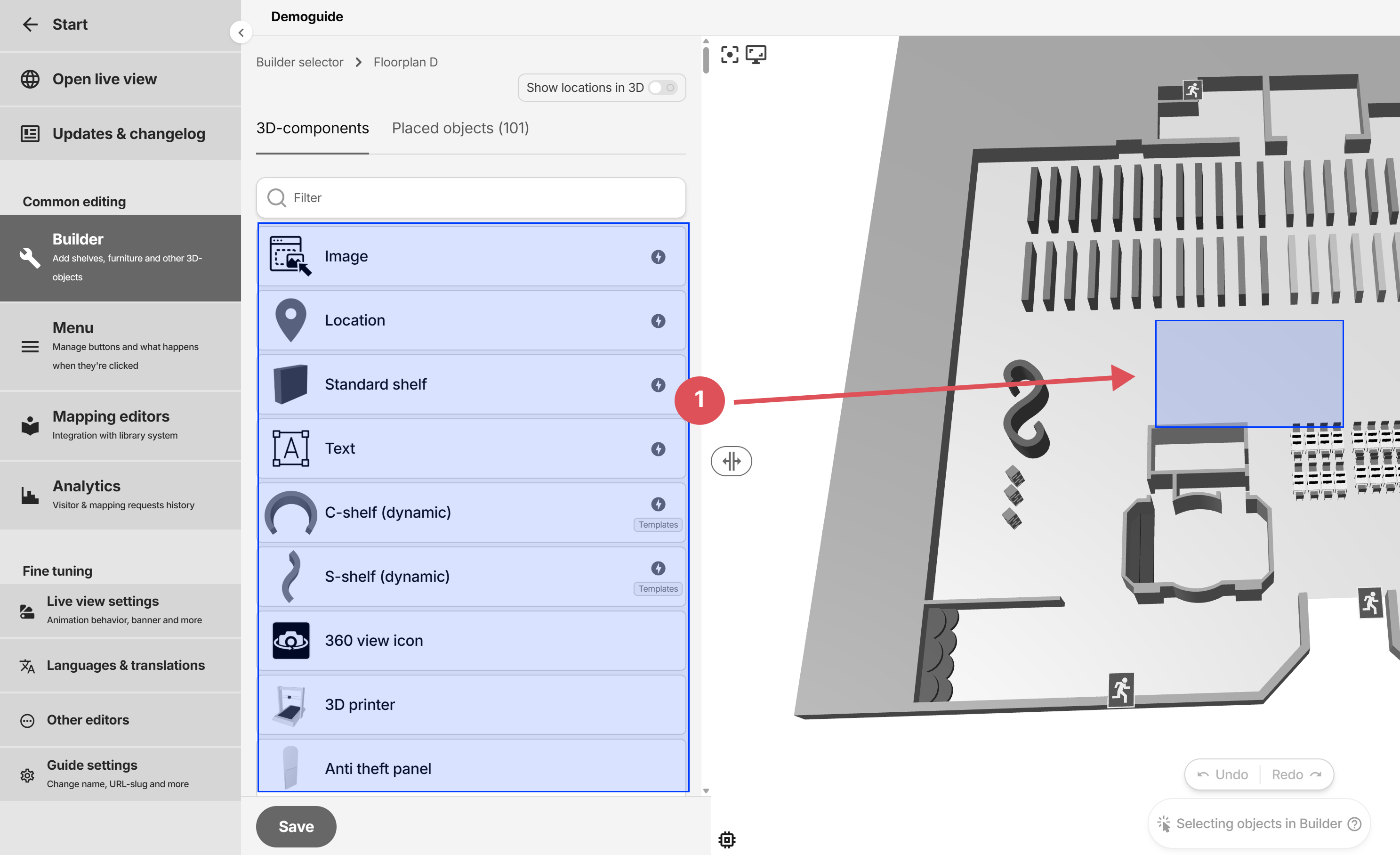
Keep in mind that the number of objects in the floor plans affects the performance of the guide.
Shortcuts
| Action | Keys / shortcut |
|---|---|
| Undo last action | Ctrl + Z |
| Redo last action | Ctrl + Y |
| Single selection | Left mouse button |
| Multiple selection | Shift + click |
| Deselect a selected object | Shift + click |
| Deselect all | Click anywhere that's not an object |
| Select all with same type | Ctrl + Alt + Shift + click |
| Look at center of one object | Ctrl + click |
| Look at center of multiple objects | Ctrl + Shift + click |
| Move selected object or objects | W |
| Rotate selected object or objects | E or ↑ ↓ ← → |
| Scale selected object or objects | R or + - |
| Align height to another object | Alt + A + click |
| Align rotation from two points | Alt + S + click two points |
| Save builder | Ctrl + S |
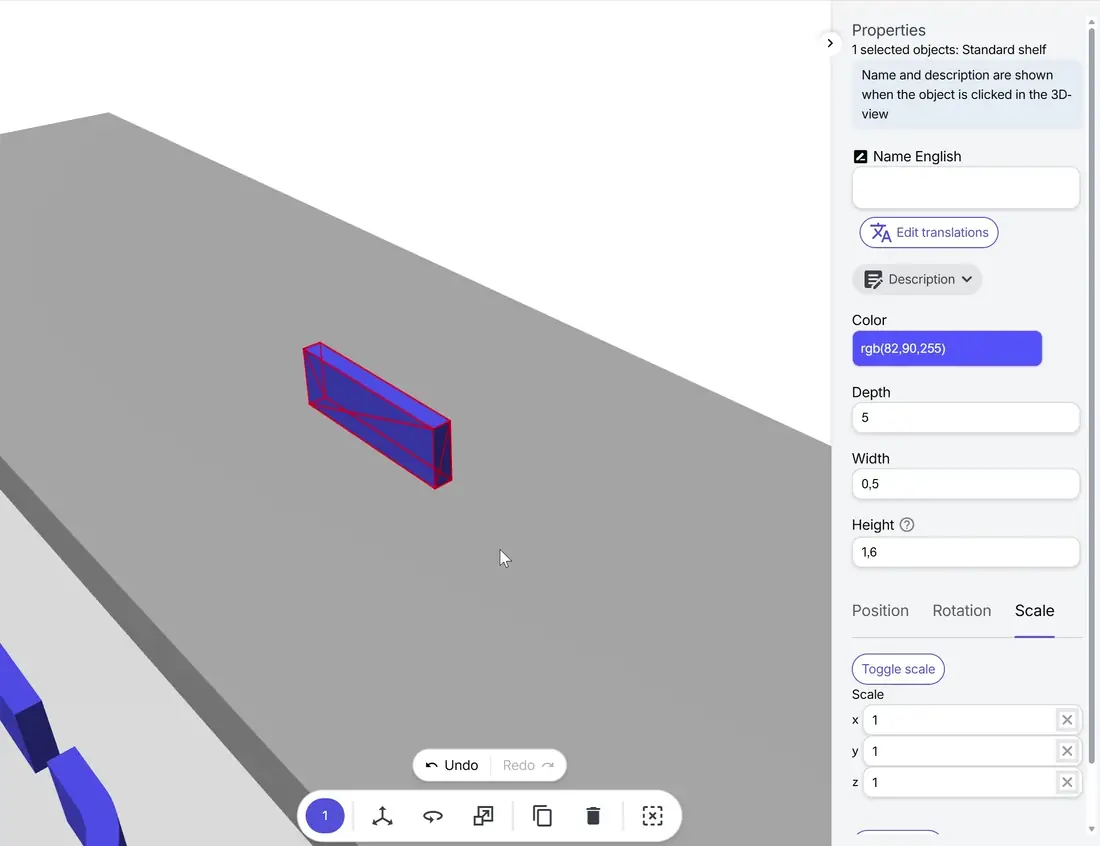
Properties menu
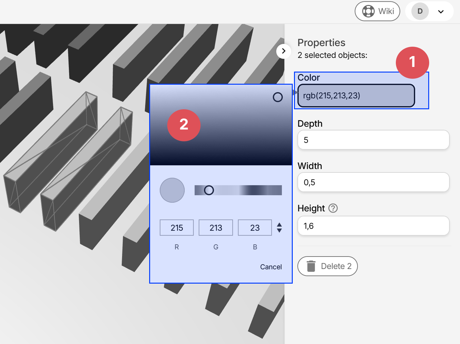
After selecting objects, the properties menu pops out on the right. Most values can be changed in bulk if the objects are of the same type (component). If the values differs between the objects, separate fields are displayed for every unique value.
Toolbar

- A: Undo last action
- B: Redo last action
- C: Number of objects selected
- D: Activate position control
- E: Activate rotation control
- F: Activate scale control
- G: Copy selected objects
- H: Remove selected objects
- I: Clear selection
Position, rotation and scale
The controls can be brought up by clicking the buttons in either the toolbar, or bottom of the properties menu when one or more objects are selected:
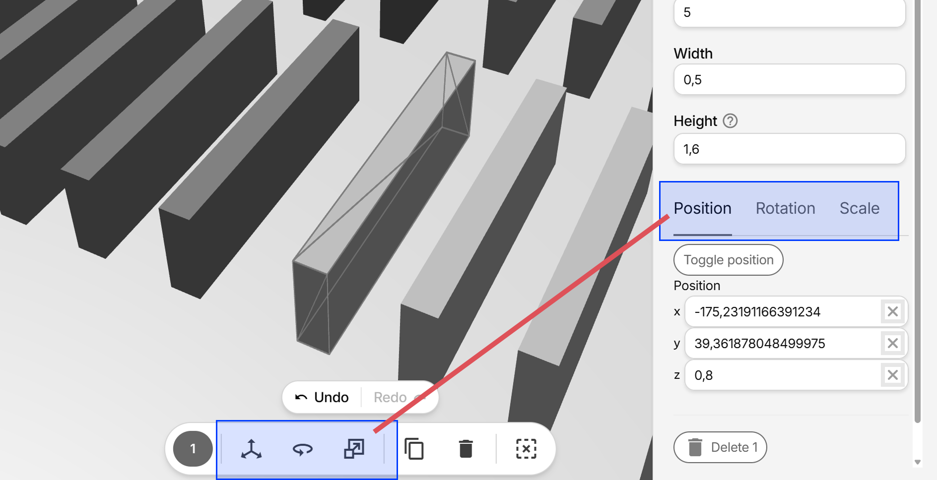
Use the controls and examples below when moving, rotating and scaling objects.
Moving objects (position)
Keyboard shortcut: W
Rotating objects
Keyboard shortcuts: E or ↑ ↓ ← →
Scaling objects
Keyboard shortcuts: R or + -
Copy/paste objects
- Select one or more objects (by holding Shift and click, or holding Alt and window select) and click the Copy-button in the toolbar (Ctrl + C) to copy them.
- The newely created objects are now selected, so press W to bring up the position controls.
- Move the objects to the desired position.
Change color of objects
The color option will only appear if all of the selected components are of the same type.
- Select one or more objects of the same type.
- Depending on the component that's selected, different color options will appear.
- Click on one of the color options and drag the slider to change.
Object names
Object names are optional and can be used to:
- Make the object searchable
- Display a small popup next to the object when clicked.
To set the name, select an object and enter the text under Name. Remember to input the different translations if needed.
Deleting objects
Select one or more objects and click Del or the Delete button in the properties menu.
Saving Builder
Click Save-button or Ctrl + S
Special components
The special components, marked with a lightning bolt icon in the component list, have additional settings compared to other normal 3D-object components
Image
Upload regular image files and add them to the 3D-view. The images are uploaded as Icons (same icons that's used for Menu buttons).
Since the Image behaves like any other object, you may rotate, position and scale it as usual.
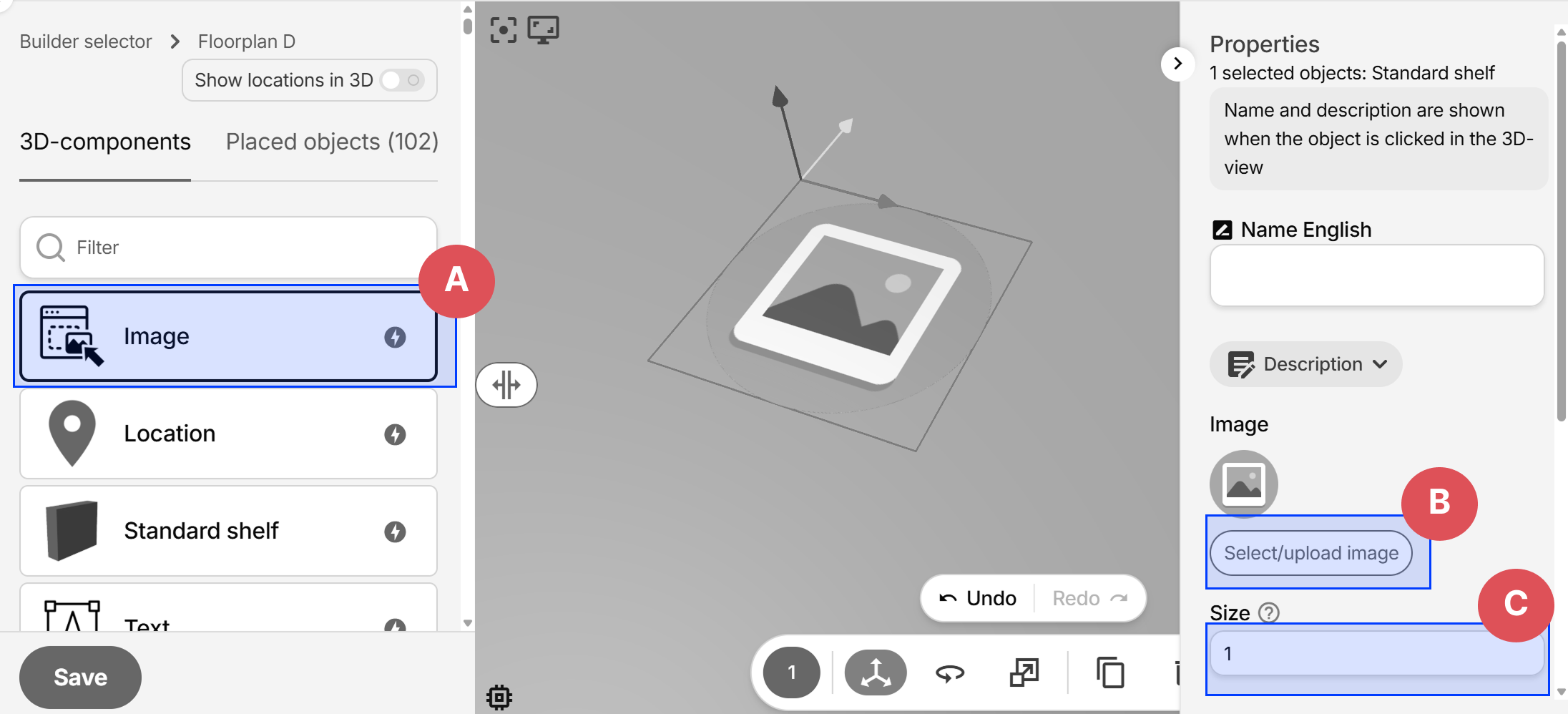
- A: Add a new Image object
- B: Change the used image
- C: Change the image size
Location
Locations are hidden objects that can be referenced in animations. Useful when not wanting to clutter the guide visually with too many objects.
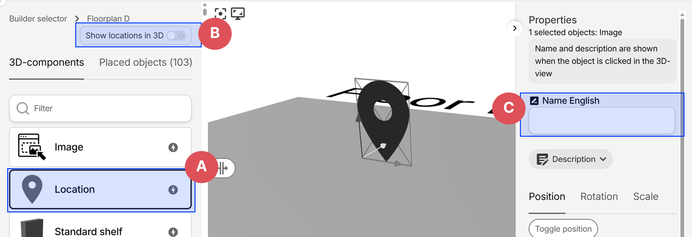
- A: Add a new Location object
- B: Show or hide Locations in the current editing view. This has no effect on the live view.
- C: Setting a name makes it easier to identify when later selecting them in animations
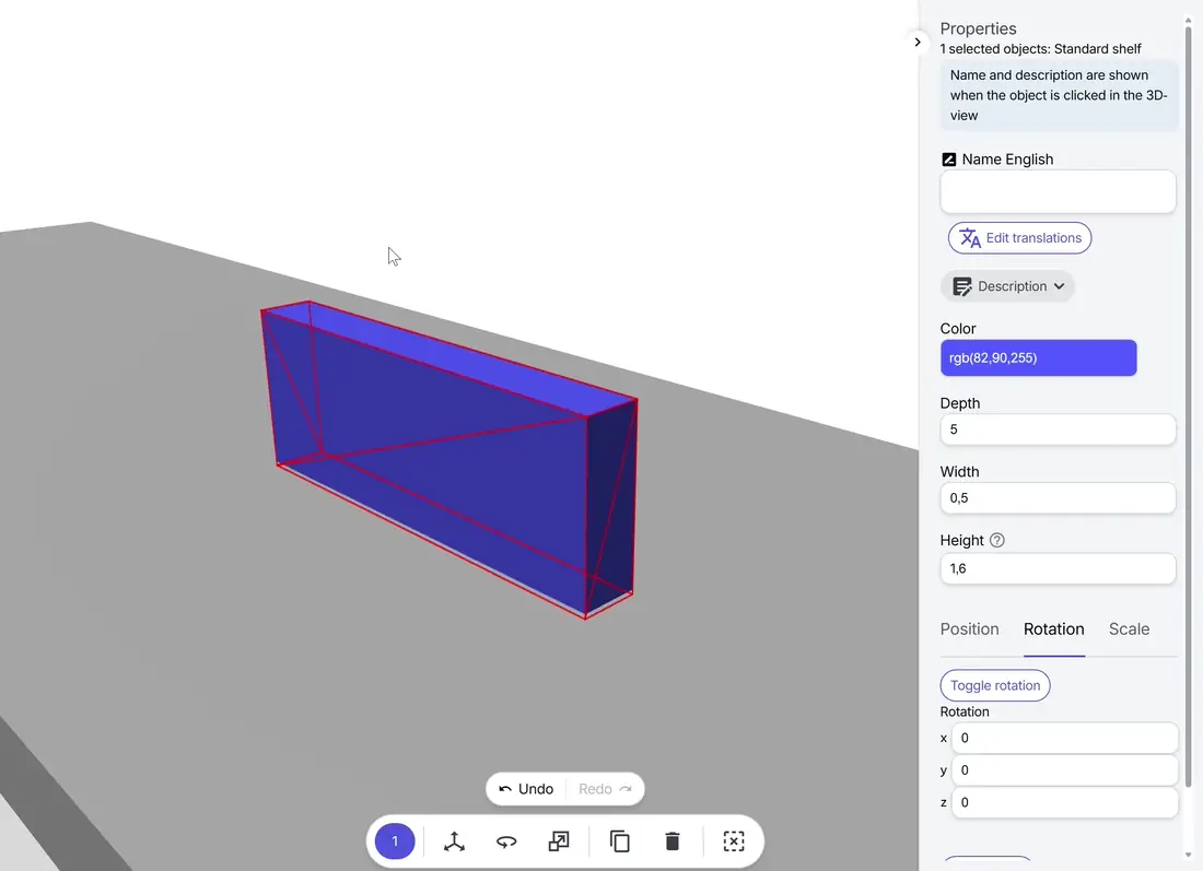
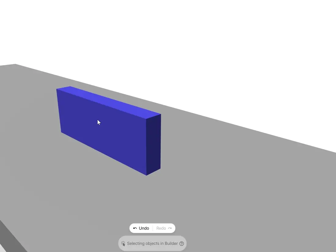
Standard shelf
The Standard shelf component has dimensions (depth, width and height) that roughly translates to meters.
Note: the dimensions may not correspond to the actual 3D object, since the orientation of the 3D scene affects the direction.
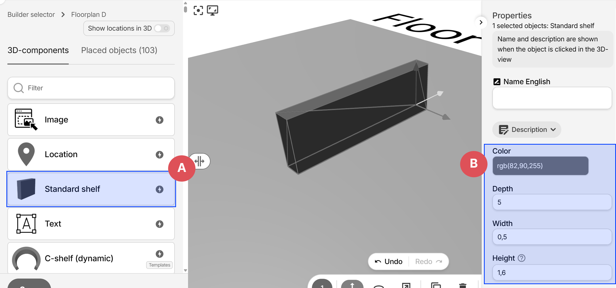
- A: Add a new Standard shelf object
- B: Set color, depth, width and height.
Text
Adds translatable text to the guide, useful for entrances, street addresses, room names and more:
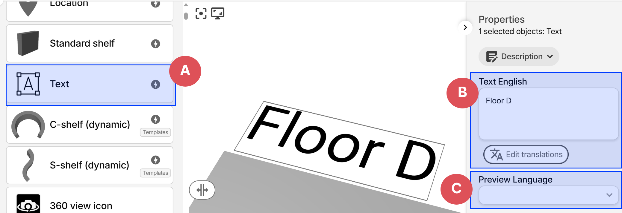
- A: Add a new Text
- B: Enter the text value, and translations via the button below.
- C: Temporarily preview the text with another translation. This has no effect on the live view.
For long texts, you can press Enter to create new lines, this will make the text span multiple rows.
Since text often differs in length for different translations, setting the text alignment to Center makes the position more predictable.
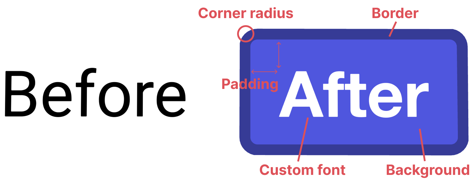
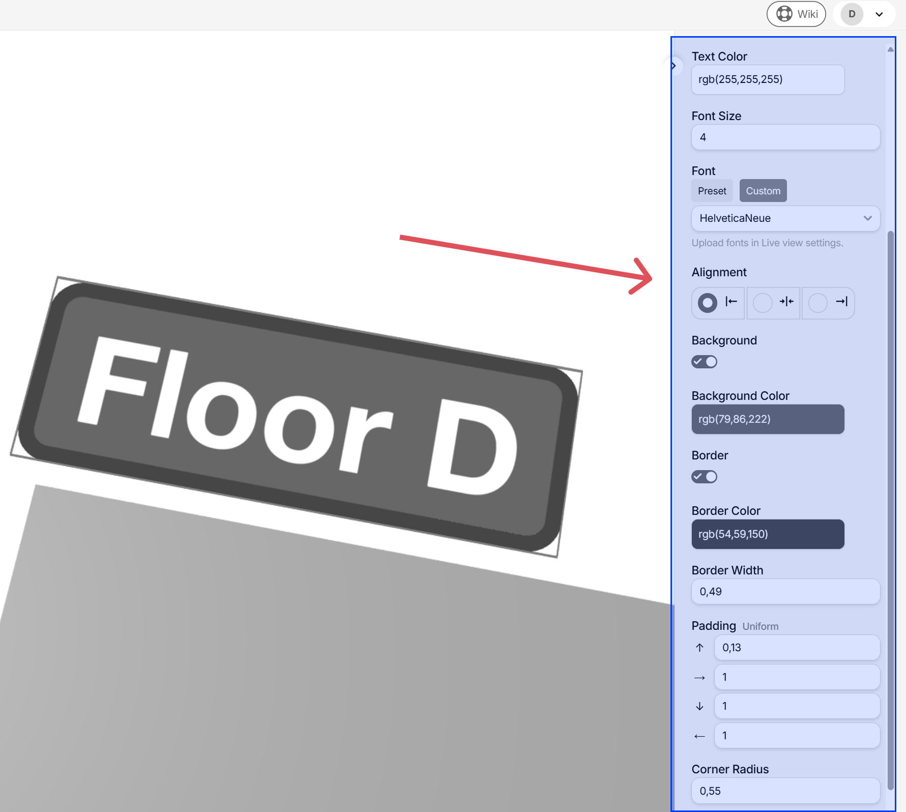
Text customizations
Texts can be styled with size, color, background, border and corner radius. You can either use the built in fonts, or upload your own under Live view settings, and selecting the Custom button under Font:
C-shelf (dynamic)
A rounded shelf that can be transformed with different settings.
Tip: use the mouse scroll wheel in the number fields to increase or decrease values
S-shelf (dynamic)
A shelf that can be transformed with different settings.
Tip: use the mouse scroll wheel in the number fields to increase or decrease values